Hey everyone, I have decided I am going to be taking a break from Shirt of a Canuck for a while. It has been so much fun to run this blog, but I am simply not getting enough input to make this blog sustainable. I am by no means shutting this down, I am simply pressing pause until I have some more Canucks concept ideas (for the past few months I have basically done no other concepts except Canucks ones, and I really need to take a break from doing that. I feel my creativity is wearing thin for Canucks stuff). The site will stay up, and I will still publish any comments, and if I do get concept contributions, I will post them (eventually).
I will likely start a concept blog of my own where I will post my work for other teams, but I haven't set that up as of yet. Once I do, I will post it here.
In the mean time, I will be writing on fridays for HJC, and as always you can check my work out on that site.
Lastly, I want to extend a huge thanks to all of you who have read and contributed over the past few months, you have been awesome.
As Arnie said "I'll be back."

Tuesday, August 21, 2012
Friday, August 17, 2012
Friday, August 17: Contributors Concepts
Matt Marczel is back with his proposal for a Canucks alternate:

I like what Matt has done here. It's green. It's vintage inspired. You gotta know I'm gonna like this!
The work on the logo is superb. I especially like the diamonds, they really fill out the circle. I am not sold on the off colour name-plate. I can't say it looks bad, because it looks good, but that element really belongs to Philadelphia. Overall really solid work.
If you have any comments or suggestions for Matt, please post them in the comments below.
Thanks for reading!
Friday, August 10, 2012
Friday, August 10: Contributors Concepts
Hey everyone, sorry for the lack of posts lately. Life is busy between finishing up summer classes, and preparing to go away next week. Honestly, I don't think I will be able to get a midweek post up this week, but I may have some time to work on concepts, which would mean I would have a solid set of posts for the following week. There will a friday post for sure next week.
These last few weeks have been a bit of a dry stretch for SOAC, simply because I have not had a lot of time to do concept work. I will probably not have enough time to create enough Canucks concepts to fuel this blog the way I have for the past couple months in the future. I will be writing for HJC, in addition to SOAC come the end of August, and I know I will have less time for PURELY Canucks concept work.
SO, I want to encourage you readers to send me your Canucks concepts. My concepts alone will not keep this blog going (In truth I am scraping the bottom of my barrel for Canucks concept ideas, and am tiring of having to make basically only Canucks concepts to provide enough material for SOAC), and it would really take some pressure off of me if I could feature more work from others on this blog. Please send your work in to me: shirtofacanuck@gmail.com
As mentioned earlier this week, Matt Marczel makes his SOAC concept debut this friday. Matt sends along his ideal Canucks home and road uniforms. The look of every ideal Canucks set that has been set in to SOAC follows the same basic idea (Use the current third jersey, or a slight variation of it, as the home sweater, and create a matching road jersey). Matt does the same here, BUT also sends along another option which he would consider if he were in charge of choosing Canucks unis.

The striping pattern used looks really great on the home sweater, but looks a little awkward on the away sweater. I actually don't think the blue cuffs are necessary. If you are going to use them, I would either make them small cuffs, like on the habs uniform, or merge the lower blue stripe with the cuff (so remove the low white stripe). but really I think it would look best with no cuffs at all.
I really like the gloves, they are simple and cool, and really hearken back to the uniforms from the 70's.
The second set Matt sends along is one he would consider for the main home and road sweaters. I have made similar sweaters, and think that they would be best suited as home and road alternates (if the NHL allowed teams to wear more jerseys).

What do you think of these sweaters? If you have any brilliant ideas for Matt, please post them in the comments below.
We will see a proposition for a third jersey to go along with these home and away options from Matt next friday!
Thanks for dropping by!
Saturday, August 4, 2012
Saturday, August 4: A Quick Update
I am back from vacation, but am not going to be posting as much on SOAC for the next few weeks. I know I had said I would probably have a new post for today, but instead of writing that post, I have written a post over on HJC as part of the application process to write for that blog. Swing by there at noon eastern time to check that out. If I do end up getting that gig over on HJC, I want to keep SOAC up and running, and I think two MAYBE three posts per week would be doable for me. For the next couple weeks that is what I am going to be aiming for here on SOAC.
This week is going to be a busy one for me (between finishing up summer school, making concepts for Icethetics' latest IceHL jersey design competition, and preparing to head out on another short trip) so I am really not sure when I will get my next concept post up. There will still be contributor concepts on friday so check back then for that. hopefully I will get another post or two up this week, but no guarantees.
Also, I have a few corrections to make to some of the information I posted in the last concept post I did from Wednesday, August 1. Reader Matt Marczel passed this along:
Colin
The Vancouver Giants logo was originally proposed to the Canucks as a primary logo during the Canucks 1996 rebranding phase which produced the Orca logo. Local graphic designer Brent Lynch designed both the Giants logo as well as the Canucks Orca. Brent Lynch also most recently designed the Victoria Royals logo. I read about the info regarding the Giants logo in an article regarding the Victoria Royals logo unveiling last summer. The link below is to an article that is a carbon copy of the one that I read a year ago.
Matt
Thank you Matt for catching my mistake, and finding the correct information!
We will hear again from Matt next friday when he makes his SOAC concept debut.
Friday, August 3, 2012
Friday, August 3: Contributor Concepts
This week we have another concept from Steven. Some of you may have seen this on other sites, like Icethetics, or HJC, or even on Steven's own blog, but I still wanted to post these on SOAC. I actually requested he send them in, thankfully Steven obliged, although he was a bit hesitant, because he probably wouldn't want the Canucks to wear these in real life.
What I like most about these concepts is Steven's tremendous creativity. These concepts are not what you expect a traditional hockey uniform to look like, but they are clever, and well polished. I really do appreciate it when artists try to be creative, and take some risks with designs.
The first version of this concept is a quite risky with the two-tone, sublimated green chevron pattern, and overall it does make the jersey seem a bit busy.
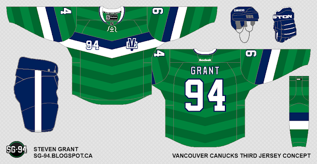
The second one eliminates the sublimated green chevrons, and goes with a simple green base. I really like this jersey with the simplifications.


This type of chest stripe seems right out of the world of soccer to me (clearly during the summer months, my mind seems to go to this world...). It reminds me of the kits worn by both the Canadian Women's National team, and Manchester United, both of which look really sharp.
Wednesday, August 1, 2012
Wednesday, August 1: What Might Have Been

The fact that this logo was first rejected by the Canucks, and then introduced by the Giants in 2001, leads one to think that this logo may have been considered when planning the new alternate sweater which the Canucks introduced in 2001. This would have been a major departure from the Orca Bay logos, and a huge step back in line with the original Canucks identity. Perhaps the Third jersey would have ended up looking something like this:
 As you can see, I have maintained the layout of the third jersey worn from 2001-2006, but have used an updated version of the Giants crest instead of the Orca. I have simplified the Giants crest to instead be a V shape (for Vancouver), instead of a G shape (for Giants). I have also altered the colour scheme to fit the colour scheme worn by the Canucks from 1997-2007 (the fact that this recolouring does not appear forced, also adds soem legitimacy to the thought that the Giants logo was originally intended as a Canucks logo). I maintained maple leaf detail on the Lumberjack's sleeve, however, did try to make it more subtle. I do think that it is kind of tacky for a Canadian team to feel obliged to put a maple leaf somewhere in their logo, but Canuck is a slang term for Canadian, so I don't feel that the inclusion of a maple leaf is unwarranted.
Just for fun I have also included home and road sweaters which go along with this concept. I based them off of where I felt that the third jersey design, and other similarly progressive jersey designs from 2001 in the NHL, were leading. Hope you enjoy!


So that's that. Fun to relive one of my favourite eras from Canucks history, and do a bit of historical re-imagination, and a bit of logo alteration. All around good times. Hope you enjoyed it as much as I have.
Come back on friday to see some more concepts from contributor Steven Grant.
I will be back on the weekend, but can't promise a post, however I will be able to publish any comments which you have submitted in the past week.
Thanks for reading!
Subscribe to:
Posts (Atom)