Saturday, July 28, 2012

Saturday, July 28: A flash back to my earliest ever jersey designs.

Hey everyone, I really appreciate you stopping by to the site. Running this blog has been a lot of fun for me, and it has been really good to share ideas and receive feedback on my designs. I feel that as a concept designer I have only improved since starting up this blog. But it has not been as easy as I thought. I am constantly challenged to create fresh and creative concepts o a regular basis to post on SOAC. I guess this is to say, I have been getting a lot of practice with designing hockey sweaters. The old saying practice makes perfect does not apply to me and my designs, but practice certainly makes better.

Last month I won my first COTW on HJC, and this concept went on to beat out some fantastic designs to claim the COTM for June. Since submitting this concept I actually worked with some more suggestions and improved the road sweater (you can check out what the finished product looks like on the final concepts page).

I have been designing jerseys on my computer for about a year and a half now, and have been drawing hockey players and hockey jerseys in notebooks for many years before I realized people actually did this on their computers, and posted their work online. This has become such a fun hobby for me, but I want to look backwards today and encourage anybody who is just starting off, by looking back at some of my early jersey designs.

Many of the designs you have seen me post here on SOAC have been incubating for years. You may remember this design from one of the very first concept posts from this site. It wen through many evolutions before the final product was complete. I tried many different templates, and many different ideas for arm striping. I also made many errors along the way.

My most recent Canucks concept which I made up before working on the designs which would wind up on SOAC, was this one. I concept which I polished up in February 2012 and printed off to take to a David Booth signing (I don't like to get jerseys signed, because, then I feel like I can't ever wear them again... and I didn't have a Booth card, so I made up and printed off a custom Booth concept!). I wanted to make sure it was polished, but I still made the error of not putting the hem stripes over top of the jersey stitching.

Here is another version of the home concept which I made in June 2012. It is essentially the same sort of concept as the previous one, but lacks polish, and does not have the skills applied to it that I learned and applied to the previous concept. I don't have shoulder patches properly applied to both sides of the sweater, and I make the same mistake with the hem striping. Also, the experimentation in the sleeve striping just doesn't look good, it doesn't even compare with the finished product.

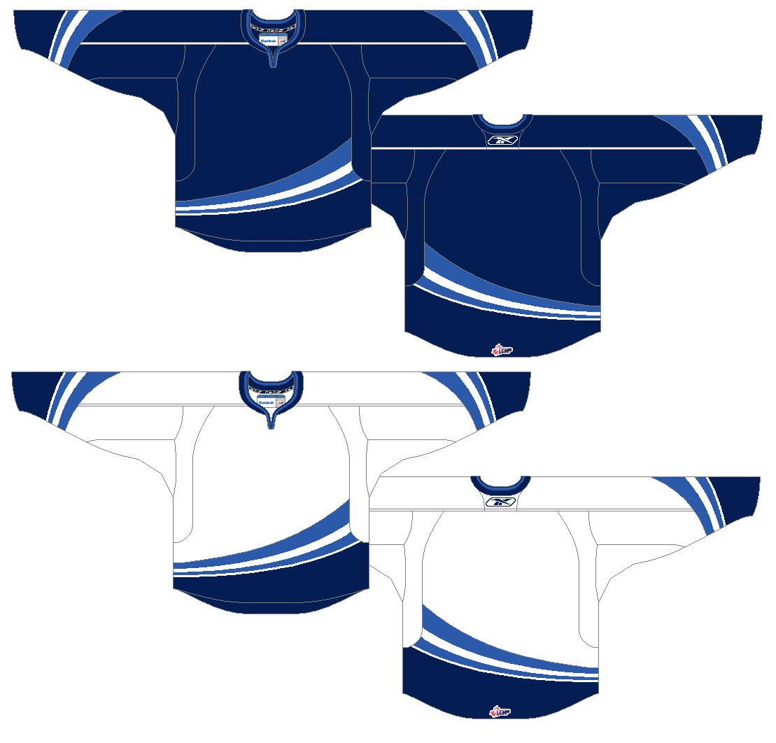
Taking an even bigger step back we arrive at some of the earliest Canucks designs I did during my first month of concept designing in February 2011. For the away sweater, note how the striping has basically stayed the same all throughout the process of designing this sweater. Also look at the TV numbers... they are drawn freehand! I didn't know how to rotate numbers by a few degrees, and hadn't found a template where I could apply them horizontally, so I drew them on. Interestingly, I didn't make the mistake with the hem striping not going over top of the jersey stitching on these concepts. I can assure you I did not get this right consciously.


I guess the point of this post is everyone has to start somewhere. I am not saying I am the best designer in the world (I am clearly not), but I am saying that I have improved with practice. There is still a long way for me to go, and may things for me to learn, but I will keep doing this as long as I enjoy it, because that is the main thing.

I started doing this just for fun, while I listened to the radio broadcast of Canucks games in the late 90's/early 2000's. I started by just colouring jerseys, and it has evolved into something much more sophisticated than that. Recently, I dug up some of my very jersey designs (which were made on index cards which I cut into the shape of a hockey sweater, and coloured with pencil crayon). I made these up and hung them from a string to decorate my bedroom.


As you can tell, the ideas which show up on these concepts have influenced designs I have posted on SOAC. I also want to point out that a twelve year old came up with the idea for a blue and green orca uniform 5 years before the Canucks did. That fact puts how awful our current uniforms are in perspective, eh?  :)

Anyways, thanks for  stopping by. I'm sorry that I have had to scrap one of my posts next week. I just haven't had time to write it between packing and finishing up course work for summer term. There will be a post on wednesday (which will be well worth stopping by to read), and a contributors concept post on friday. I get back on thursday night, so will probably have time to write the post which was intended for monday then, and will probably post it on the weekend.

Thanks for reading!

Friday, July 27, 2012

Friday, July 27: Contributor Concepts

Hey everyone, we've made it to yet another friday, which means we have some more work from people other than me.

Before we get to that, a bit of housekeeping. As I mentioned, next week I will be on vacation, and have set up some auto-posts to go up while I am away. I laid out a schedule of these posts on Wednesday, but have had to scrap one of the posts (the one on monday, simply because I did not have enough time to write it, and do everything else which I needed to do before I left). There will be posts on wednesday and friday, and I hope to finish the scrapped monday post when I return home on thursday, and post it on the weekend.

Anyways, lets get on with the concepts:

This week marks the debut of Steven Grant on the blog. Steven runs his own concept site (sg-94.blogspot.ca) but has kindly sent along some Canucks concept work to me.

Steven sent along his ideal Canucks sweater set. The home and road sweaters are very similar to the sweaters worn from 1972-1978, except the logos have been slightly altered, making the overall shape and outline pattern really similar to the current updated Stick in the Rink logo, but maintaining the simple "stick" part of the logo, and staying true to the original colouring of the jerseys. I really like these subtle changes. Good work, they really do make a difference. As you probably know, I am not a fan of the striping pattern introduced in 1972 (I have always thought that the 1970-72 striping was much more creative), but I really can't complain about my personal preference. This look is classic, and well put together.


THE THIRD JERSEY IS AWESOME!!! It's green. It's retro. It uses the VC logo. It reminds us of the millionaires jersey. If I were me making this sweater, I might make the hem stripes straight, and I might make the shoulder numbers a bit bigger. Other than that, no complaints. Really well done Steven, I look forward to seeing and posting more of your Canucks concepts.

Thanks for stopping by, and thanks for reading! I look forward to seeing your comments, and emails when I get back!

Wednesday, July 25, 2012

Wednesday, July 25: Green Alternate (continued)

Last week I posted this green sweater, but wasn't sold on it. I wasn't expecting a lot of positive feedback on this one. Despite my own hesitation, people seemed to like it. Nevertheless, I have tried to innovate. The treatment of the VC logo being placed in the arm stripes was inspired by the way the C with crossed tomahawks logo was placed on the Blackhawks sweater from 1956-1959. This is such a classic look.  I also added some football style numbers in the top of the shoulders (as the sleeves would have been too crowded if I place the numbers in the usual position).

The circle logo, and the treatment of the arm patches had a real Chicago feel to it (the Hawks used a circle logo often, most recently on their Winter Classic uniforms). Despite Vancouver's rivalry with Chicago, I can admit one thing about the Hawks: they do get their uniforms spot on. I have thought this for a long time, and even made a Canucks sweater based on their Winter Classic uniforms early on in my concept designing career. Here it is:


Today I revisit this concept in an attempt to explore other options on my quest to find a great green alternate for the Canucks. The first thing wrong with this concept is the logo. The logo is not a classic logo, and this jersey screams old time hockey. The numbers fall into the same category, not old-timey, on a faux-back sweater.

Here is my first attempt at fixing this sweater. It is basically a Chicago Winter Classic rip-off, but hey, with that striping pattern, you can't really go wrong.


The next concept is a slight departure from the Chicago Winter Classic form, with the switch of the circle logo to the shoulders. I like how this swap has worked out.


I would love to know what you think of these sweaters, and if you have any ideas or suggestions.

Now for whats coming up next on SOAC. I am going away on a little vacation for the next week or so, but there will be posts on SOAC. here is what is coming up:

Friday, July 27: Contributor Concepts
Saturday, July 28: Evolution of My Jersey Design
Monday, July 30: The Quest for a Green Alternate continues POST DELAYED... probably until the weekend. Sorry.
Wednesday, August 1: What Might Have Been
Friday, August 3: Contributor Concepts

For the time being, I am going to try to be posting regularly on Monday, Wednesday, and Friday (with the occasional Saturday post). My post are typically set to go up at 9:00 AM here in Vancouver. (perfect for a lunch-hour read for my friends out east!) Be sure to take note of that and drop by accordingly.

Thanks for reading!

Monday, July 23, 2012

Monday, July 23: A Typical Vancouver Monday

Municipal Flag of Vancouver
I am feeling very "Vancouver" today. Got out to watch the Whitecaps reserves in action (in the rain) this morning, and now sit in a coffee shop sipping a latté and writing this post. Typical Vancouver.

Today's concepts are based off of the municipal flag of Vancouver.
Provincial Flag of British Columbia
I have always liked the Vancouver flag, it has a good colour scheme; as I have said before, blue white and green really fits the city of Vancouver. I also really like the symbolism of it: The blue and white lines represent the ocean, the green represents the land which Vancouver was built on, and the emblem uses symbols from heraldry to tell us that this is a flag of a city (the crown represents this), built on the industries of forestry (the axe), and shipping/fishing (the paddle). I also like the strong connection to British Columbia's provincial flag with the wavy blue and white lines.

The concept by Jets96, which I posted last friday really got me thinking. I said that it reminded me of the Drummondville Voltigeurs sweaters. I have wanted to design a sweater based on the flag of Vancouver for a while, but was hesitant to because I wasn't sure how to deal with the wavy lines. I didn't want it to end up looking like this. Seeing Jets96's concept, and seeing that the Voltigeurs sweater  also had a V logo with a Voltigeur (infantryman) gave me some direction with this idea.

here is what I came up with:


These sweaters are not a simple transfer of the flag to the sweater (as I have done with my other flag jerseys), there is more symbolism employed. 

Firstly, I realize that the striping does not look exactly like the stripes on the flag. The stripes are supposed to represent water, so I tried to combine some ideas from other teams sweaters which have used stripes to represent water (notably the Rimouski Océanic, on their logo, old sweaters, and new sweaters), and fit them within the basic shape and patter of the Voltigeurs (which forms a slight V, to stand for Vancouver, in this case)

another thing I like about this slight V is that it is similar to the V formed if You rotate the Vancouver municipal flag.

The seafaring trades represented on the flag by an oar, and the ocean are represented on this sweater by the ocean only, while forestry is represented by everyone's favourite lumberjack, Johnny Canuck.

Let me know what you think of these. They were something I threw together just for fun, and I am not super pleased with them, but do think that there are some interesting ideas here. I would be really interested to see what you all thought, and to hear any suggestions you may have.

Thanks for dropping by!

Saturday, July 21, 2012

Saturday July 21: Evolution of the V

For the weekend's post I thought I would give you a glimpse into my creative process, and show you how these Flying Vs came to be.

I started making hockey jersey in early 2011 (have I only been doing it that long!?!) the first ever design I made was an Ottawa Senators jersey which I posted to my facebook. Soon afterwards I posted a few Canucks concepts, and a my friend David said "Wanna make up a demo for the flying V in blue, green, and white? I still want to see the Canucks try that. With Johnny Canuck as the Shoulder patch."

I did and just that, and here is what I came up with. This is one of my very early designs, so please, go easy on me!


I was very happy with these at the time, but as my skills improved, I knew I would have to revisit these at some point. This was one of the reasons I started SOAC, so that I could revisit some of my old Canucks designs, and apply my improved skills and ideas to them. These were pretty good for having only been designing jerseys for a week or so, but still, there is a lot to be improved upon.

The next step in this process came a few weeks ago when I posted a trifecta of Flying V concepts on this blog from Stéphane, Justin, and myself. Truth be told, I really hated the designs I came up with. They were too busy. Here they are again, anyways.


These looked more like Ms than Vs, but there were elements there which I did like. They just needed some refining and simplifying. That was the next step to come. I finally felt like I was getting somewhere. here are the results of the refining and simplifying.


I was really starting to become comfortable with what I had created, but that is where some more help came along from regular reader and contributor Stéphane, who suggested I cut off the V at the sleeve stripe, and switch some of the colours around. I likes his suggestions, they made the jersey more balanced and logical, while still reminding me of the original Canucks flying V uniforms. Just for fun, I also made up a green version of this sweater. Here are the final versions, which are now posted in the final concepts page.


So there you have it. Those are the finalized flying Vs, and that is how they came to be.

Next weekend I will also have an "evolution" post where I look back at some of my VERY early Canucks jersey designs. This will be a very unique, and interesting post. I won't say more than that. check back for next Saturday for that.

Friday, July 20, 2012

Friday July 20th: Contributor Concepts

Again this week we have more Black-Red-Yellow concepts from WinnipegJets96!

These concepts have some real potential, and with a bit of polishing could be real winners.

First off, I like the top version (without white) better, it just looks more sleeker.

I also really like the creativity of the design. It reminds me of the Drummondville Voltigeurs sweaters.

When I look at the bottom half (from the hem up to where the arm stripes cut off) of the first sweater, it looks like it belongs in the Canucks wardrobe from the late 80' early 90's. THE FEEL IS THERE!

however, when I look further up the jersey it appears empty, and loses that feel.

Here are some suggestions to help fix this:

- don't cut the V striping off on the sleeves. continue them all the way to the inside edge of the arms.

- maybe simplify the logo a bit (I find that this logo looks way clearer if you take away the small white lines inside the plate). It would be okay to do this in paint on a large version of the logo, and then shrink it down to the right size, then everything should look clear enough.

- everything on this jersey seems a bit low. I would make the logo slightly larger and then move it up on the chest. I would also make the angle of the V slightly steeper, and then continue it further up the jersey.

- the top half of the jersey seems a bit empty. moving everything up would help this, but to fight the emptiness at the top of the sweater I would also make the arm numbers slightly larger (and move them up a bit). Also for the arm numbers I would rotate them slightly (a 10º rotation works well on this template), to fit them to the template better.

- maybe adding a vertical arm stripe like Drummondville has on their sweaters could look really cool.

There is a lot to like about this concept, and plenty of potential. I would love to see what Jets96 comes up with from these suggestions!

Thanks for dropping by!


Thursday, July 19, 2012

Thursday, July 19: The Red-Headed League, and Vancouver Brand Blending

As you may know, from reading this blog, although I am first and foremost a Canucks hockey fan, the other teams in Vancouver do occupy a piece of my heart. There is a really interesting trend happening with all of the top level sports teams in Vancouver these days. They are all being led by gingers. This only lead me to like these teams, and the players who lead them even more, as I share the same hair colour (which generations from now will no longer naturally exist). There is a Classic Sherlock Holmes story which includes a large congregation of red-heads which acts as a cover up for a bank robbery. With all the gingers leading Vancouver's sports teams right now, the red-headed league seems to be taking another form. I may have to do up a poster making use of this Classic Sherlock holmes title, and all these red-headed Vancouver athletes (if and when I get around to it, it will be posted in the Canucks Design section of the blog... if you haven't visited it, check it out!)

The Canucks gingers are now well known around the NHL, and are obviously vital to the team's success. When walking around town (especially if I have a Canucks shirt or jersey on) I often get called "Sedin" or "Schneids."


But these are not the only high profile
ginger athletes in Vancouver these days. Travis Lulay the quarterback for the BC Lions, and the CFL's reigning Most Outstanding Player, the guy who led an 0-5 team all the way to winning the Grey Cup, is also a ginger.


The latest Ginger to arrive on the Vancouver sports scene is Barry Robson. A Scottish international midfielder, who has played for some high profile football (soccer) clubs in Britain, including one of my favourites Celtic FC. Last night Robson scored his first goal (a stunning header) as a Whitecap against David Beckham's LA Galaxy. Unfortunately the Caps blew their 2-0 lead (in the last 10 minutes of the match), and the game ended in a 2-2 draw.


I have wanted to do a Whitecaps inspired Canucks jersey for a while, and figured now was the time.

The Caps white jersey has some really unique elements, but if transferred straight to a hockey sweater, they wouldn't necessarily work as well as they do on the Cap's jerseys.

I really like the unique striping pattern on the front of the jersey. It is a look that works really well on a soccer kit, but I am sure would never fly for hockey.

I also really like the Caps colour scheme, and it has worked on hockey uniforms in the past (especially Pittsburgh Penguins sweaters).

I also like some of the small details on the jersey which reference the club's history, and identity (like the "since 1974" on the neck, and the WFC inside the collar.

HOWEVER, there are things which needed to be altered slightly for me to work within the parameters of a Canucks hockey sweater.

First off was the main crest. I couldn't use a whitecaps logo on a Canucks uniform. But I wanted to keep the colour scheme, and clean classic feel of the kit. There is really only one clean and classic Canucks logo which slightly resembles this crest, and would look decent enough in this place on a sweater. The VC logo (clearly one of my favourites right now!) I recoloured it to fit the double blue colour scheme, and added a silver outline, like the Whitecaps main crest.

There are other logos on the front of the Caps kit which just wouldn't jive with the Canucks. First off the Adidas logo. As the NHL has a contract with Reebok to make their jerseys, an adidas logo would NEVER show up on the front of a current NHL sweater. Secondly the Canucks play at ROGERS arena, and would likely never display a BELL jersey sponsorship on the front of their sweaters (for international readers Rogers and Bell are two of the top telecom companies in Canada, and are always competing). The solution to these problems was simple, switch Adidas for Reebok, and Bell for Rogers.

I also subbed the MLS patch for a recoloured stich in the rink patch, and left the Canadian flag as is.

Then Came the most challenging bit filling out the jersey. This jersey is white and, especially with removing all traces of Adidas (the arm stripes included), it can look very empty when transferred directly to a hockey sweater. I altered the striping on the chest slightly to make it make a little more sense on a hockey sweater, and added vertical arm striping (thinner than usual) to make up for the void left when the three Adidas stripes were removed. I also included the light blue in these stripes, because I think it is overall underused in these kits.


The equipment was simple. I could really do whatever I wanted, because the Caps wear all white shorts and socks (aside from the Adidas stripes and branding) so I just made up some stuff that I thought worked well. The pants have three stripes on them (which hint at the Adidas styling) and the socks feature navy and light blue hoops (I really hope the Whitecaps introduce hooped uniforms sometime in the future. I think they always look sharp). 


hope you enjoy this concept!


Wednesday, July 18, 2012

Another stab at a green alternate

A while ago I tried to develop a green alternate uniform. What I came up was probably one of the simplest routes to take, but in the end was something I was not really pleased with. Now that I have completed my Millionaires project, I want to start another project and come up with a green alternate that I am really happy with.

Here are some alternates which I have made that I am NOT happy with. Each of these have some merit, but are not quite right.


Then there is the alternate which was featured in the collaboration I did with Justin:


I love this one, but do want to complete what I started to develop with those first two green sweaters.

Here is a never before seen concept which I put together based on some suggestions I made to Justin when we were working on our collaboration. He tried to put it together, but said it wasn't working, so I tried, and I couldn't really get it to work either, but thought I would include it anyways, because I think there is some really interesting elements (which I would like to use on my green alternate) on the sweater.


I was going for a real vintage feel on this one with the oversized logos on the sleeves, and the large, football style numbers on the shoulders. It's just not quite right (the shoulder numbers kill it, I think... but they would really crowd the arms if I put them there)

So, with all of these ideas circling in my mind I am going to set out some guidelines for myself for creating this alternate:

1) Make it GREEN.

2) Feature Johnny Canuck prominently.

3) Go with an old-timey, vintage, faux-back feel. I want to make this sweater feel like it belongs to an original 6 club.

4) Make it connect or make sense with my redesigned the home and away uniforms.

5) Use the VC logo... it is too good not to.

I feel like my last attempt on this post is closest to  doing all these things, but still is not quite right. I am open to changing the main crest to a different treatment of Johnny. I am willing to alter the striping. I am not willing to drastically change my treatment and placing of the VC logo (I think it really works well on the arms. It feels really vintage, and makes a nice connection to the negative space V in the arm stripes on the home and away sweaters).

Please help me out! I have come down with the designer's version of writers block!

thanks for dropping by.


Tuesday, July 17, 2012

More Flying V updates

Hello Everyone, hope you enjoyed the weekend (and monday...), I had a great weekend! Thanks for dropping by SOAC even though I haven't updated the blog in a few days. I feel like I had a really good excuse though, I had a weekend pass to the Vancouver Folk Music Festival and spent the entire weekend outside in the sun (and the rain... this is Vancouver). It was a really great weekend, listening to really good music, in a really beautiful setting.

The festival took place in Jericho Beach park in Vancouver, on the shore or the Burrard Inlet. The park itself has many nice forest groves, and is steps away from the beach (and Pacific Ocean, perfect for a quick dip on a hot afternoon!) and has a wonderful view of the Coast mountains on the North Shore of the inlet.

photo from: 604pulse.com
Even though I took a break from doing any concepts or work on the blog this weekend, it doesn't mean I wasn't thinking about it. Sitting and looking at the ocean and mountains and trees (and their vivid shades of green and blue), I was reminded how perfect the Canucks' colour scheme is for this city. I also want to make a concept inspired by Vancouver's landscape, but I have other things to do and finish up before I take that on, good thing because I still need some time to formulate that idea in my mind.

For today's concepts I have a few updates on the flying V sweaters I posted last week. I had a few suggestions which I implemented, and a few additional options for this concept which I have made up. I have also added a green version.

The big change with all of these concepts is stopping the arm stripes at the piping. This is definitely more in the spirit of the original flying Vs, but steps away from the modern trend to have arm stripes all the way around the arm, over the vertical arm stripes or piping (like the Jets and Kings currently have on their sweaters). I like the way it looks, but am obviously open to suggestions.

Blue Option 1:


Blue Option 2:


White Option 1:


White Option 2:


Green Option 1:


Green Option 2:


So there you have it, plenty of options for modernized flying Vs. Let me know which ones you like best, or if you have any suggestions to make these better! I will be finalizing these concepts by the weekend (I fell like they are VERY close to being complete).

Also, if you have a Canucks concept you would like to send in, feel free to! I hope to feature other people's Canucks concepts regularly on fridays. The email you can send your concepts to is: shirtofacanuck@gmail.com

Thanks for reading!