Friday, June 29, 2012

Concepts From Friends Friday!

Hello everyone, we've made it to another friday!
Today I am excited to introduce a new feature on the blog which will hopefully become a regular thing. I have mentioned on previous posts that I have set up an email account for the blog (shirtofacanuck@gmail.com) and am accepting concept submissions (obviously Canucks themed) to be posted on the blog. 

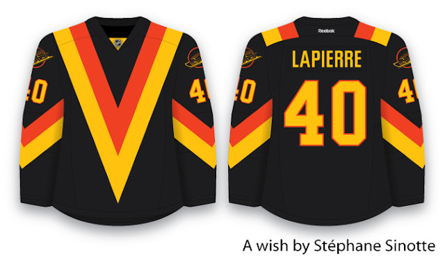
I have had some awesome contribution on the blog from some other fellow bloggers (Stéphane from Le Troisiéme Chandail, and Justin from The Art of Hockey), this has not only been through comments and suggestions on my concepts, they have also sent in some of their own work to me.

Stéphane's work strays a little from the blue and green brand identity that I, as a 21 year old Vancouverite, see fitting best for the Canucks. Nonetheless, Stéphane's work is flawlessly executed, and creatively based in the era of Canucks history which he identifies with most strongly.


As Stéphane wrote:


I don't know why most Canucks fans don't want to talk about the "big Vs" years… For me, those jerseys represent the real Canucks. It reminds me of Tony Tanti, Stan Smyl, Richard Brodeur… The years when the Canucks were in town (Montreal that is) with jerseys that no other teams could match: different, original, new. I sure wish that they could bring back that black jersey with the dominant V as a third (cause I really don't believe they will step away from blue and green now).

Obviously to complete this "wish" Stéphane would like the name on the back of the sweater to be GOMEZ instead of LAPIERRE, but seeing as Mike Gillis has again proved himself a capable GM (with the recent Schneider signing), I don't see that happening anytime soon.

I really like this design. It is way more logical than the original flying V sweaters, but does not lose any of the boldness of the original sweaters.

I have really grown to enjoy the flying V sweaters (I definitely want to add one to my jersey collection!). Stéphane mentioned that he doesn't think that the Canucks will abandon the blue and green colour scheme, but to bring back the Vs, you don't necessarily need to bring back the hallowe'en colours. One of the first ever concepts I did was a Flying V jersey in blue and green. This post acts as a bit of a teaser for the updated version I am working on. Look forward to that in the next week or so.

Justin has also sent in a great concept. A few weeks ago when I was working on green alternate sweaters, Justin sent his take along.


There are a number of things I like about this concept, love the green, love the fact that Justin does not shy away from the striping (I tend to be way more minimalist when it comes to stripes, Justin is brave enough to make all these stripes work!). I also love the logos. That VC logo is a hidden gem, and I have no idea why the Canucks have not used it on a jersey yet.

His presentation of the full body skating Johnny Canuck logo is one of the two ways that I have seen work on the front of a jersey. The second is the way I presented in this post, which I admittedly did not come up with. I think I first saw it some sort of Canucks official merchandise (maybe a T-shirt or flag). By itself, the skating Johnny Canuck logo seems awkward and unbalanced to me (almost as awkward looking back on this photo retrospectively after the 2011 Stanley Cup final...). Even Tanner Glass can't make these jerseys look great, although if having awkward looking sweaters for the rest of time meant having Glass back on the Canucks, I would seriously consider taking that offer, what a gamer!


I like the old-timey vibe I get from Justin's green third jersey, and have encouraged him to push it a little further. Justin came to me with the idea of collaborating on a Canucks jersey set. His third with my home and away sweaters. This is really great because together we can make all of our jerseys better. When we finish our collaboration, I will definitely post it. Consider this another teaser!

Anyways, that is all I have for today. Check back for Canada day stuff this weekend. Next week I am going to continue working on the classic uniforms, hopefully we can make some headway on those and get them wrapped up by the end of next week.

Thanks for dropping by!

Thursday, June 28, 2012

Classic Away Jersey Update

Based on a suggestion be Stéphane, to use the same crest from the home version of this sweater, I have made a few alterations. It seems that this sweater is proving more challenging than I initially thought it would. All of these are definitely works in progress.

Take a look at these options, if you have any thoughts, comment below.


Check back tomorrow for some concepts, which aren't mine! Also, some more fun stuff coming up on the Canada day long weekend!

Tuesday, June 26, 2012

Tying Up (or Lacing Up) Loose Ends

Thanks for dropping by! Double thanks if you stopped by last week to voice your opinion (via vote) on what a Canucks classic uniform should look like.

I have been working with the Vancouver Millionaires sweater as my jumping off point, and had come up with many options (check out older posts to see all the options) . The basic questions which we voted on last week determined the role of the Canucks colour scheme would be on these sweaters. 63% of voters said the Canucks should use vintage white on a classic sweater, and 53% of voters voted for a blue and white jersey (omitting green entirely for the purpose of simplicity). What these votes tell me is this: "Keep it simple. Keep it classic."


So with our results form last week, we have our classic home sweater determined:


As I mentioned last week, I want to make a matching version of this home sweater for the road sweater, however that does not necessarily mean taking the simple route of inverting the colours.

As presented in the middle of last week, I see two possible options that could work really well for creating a matching road sweater to go with this home sweater.

OPTION 1:


This one is a direct inversion of the home sweater.

OPTION 2:


This option is largely an inversion, except for the shoulder yoke and collar area, which basically matches the same area on the home sweater.

There is a new poll up on the site. Vote on which jersey you prefer. Also, if you have any suggestions on either of them, let me know in the comments below.

On to the fun stuff!

A Winter Classic or Heritage Classic uniform would not be complete without equipment. There are many different ways which we could go with the equipment. I could make them brown to mimic leather. I could make them navy blue to match the sweaters. I could make them vintage white to mimic the canvas look. I am not so concerned with having matching equipment, because these are specialty uniforms. I am more concerned with composing two uniforms (complete with equipment) which look really good. If they match, great. If not, no big deal.

I am going to post options for helmets, gloves, and pants and then discuss what my optimal combination for both home and away uniforms. I also have done up socks which logically follow the striping pattern, if you have any suggestions on those, obviously comment below.

Helmet options:
brown, blue, vintage white


Glove options:
blue and "canvas", brown and "canvas", brown


Pants options:
"canvas", brown, blue


Socks:
blue, vintage white


For the home uniform I would choose the brown helmet, with the brown and "canvas" gloves, and the "canvas" pants, with the blue socks.

For the away uniform I would choose the brown helmet, with the brown and "canvas" gloves, and the brown pants, with the vintage white socks.

Let me know which combination you like in the comments below. Also, don't forget to vote on the poll.

Thanks for reading, check back later in the week for more fun stuff!

Tuesday, June 19, 2012

Continuing to Conceive a Canucks Classic

Yesterday I mentioned that there were options when it came to the away version of the Millionaires inspired Canucks Winter Classic jerseys.

Back in 1915 it was very rare for a team to have home and road sweaters. And the Vancouver Millionaires were no different. So, for me there is no light sweater off of which to base a Millionaires inspired Canucks road concept.

The best option seems to be to let the dark jersey dictate what the light jersey will look like. Basically all the choices will be made in terms of vintage white or not, and the striping pattern when we work out which route to take with the home version of the sweater. The away version will match. However, I am a big fan of the shoulder yoke when used on a lighter coloured jersey, and I think it could really work in this case. Let me know what you think!

white:
vintage white:

white with yoke:

vintage white with yoke:


Thanks for reading!

Monday, June 18, 2012

Making the Canucks Look Like a Million Bucks

Once the 2013 winter classic is complete, Vancouver, Ottawa, and Winnipeg will be the only Canadian teams which have not participated in an outdoor game. The Vancouver Millionaires defeated the Ottawa Senators for the Stanley Cup in 1915. A 2015 Heritage Classic between the Canucks and Senators to commemorate the 1ooth anniversary of that match seems a very likely possibility. I, however, would be very disappointed to have to wait that long to see the Canucks in an outdoor game. The Canucks are one of the best teams in the NHL right now, and they are as popular and widely supported as they have ever been. In my opinion, if the NHL waited until 2015 to put the Canucks in a "classic" game, it would be a huge mistake.

One thing that this outdoor game possibility has right is the Vancouver Millionaires. Any defensive Vancouverite, when mocked by a Calgarian about the number of Stanley Cups won by their team will pull out the Millionaires, saying something like "Well, Vancouver has won a Stanley Cup..."

Recently, the Canucks bought the rights to the Millionaires brand, and it seems like a sure thing that the Canucks will wear Millionaires inspired sweaters when they get their shot at playing in a classic.

Millionaires throwback uniforms have been done in Vancouver. The WHL Vancouver Giants have worn them in the past. But the problem with a direct Millionaires throwback is that it does not embody any of the Canucks brand. The Giants wear burgundy, so to switch to a burgundy uniform with the "Vancouver V" crest on the front did not really threaten their brand. For the Canucks, at this point to introduce any new colours would hurt their brand.

These jerseys were pretty cool, and had all the elements of a classic jersey. Sweet old-school striping, a simple logo, and the most important thing for any classic uniform: a lace-up collar. All in all, these uniforms do scream retro, and represent Vancouver really well, but they do not represent the Canucks very well, mainly because of the colour scheme.

So, the solution seems pretty obvious to me. Millionaires jerseys in the Canucks' blue, white, green colour scheme. However, one question still remains: to vintage white, or not to vintage white?

Today's post will include options for a dark sweater. I will show each one with white, and vintage white. All concepts use the classic 4 bars on the arm striping, a lace-up collar, and the Millionaires "Vancouver V" logo. I have used a darker blue than the Canucks usually wear, but it is still technically part of the Canucks colour scheme, because it is used in their logos. Also, to add some more Canucks flavour to the uniforms, I have included a subtle stick in the rink logo on the shoulders in a slightly lighter blue. here they are:

Classic Concept 1

white:
vintage white:


For this first set of jerseys I have only used the dark blue, and have basically subbed it for the maroon. For the Numbers I have used a stitched on style like Buffalo did with their anniversary jerseys. Again notice the subtle stick in the rink shoulder patches.

Although I feel that these jerseys stay true to both the heritage of the millionaires and the identity of the Canucks, some might criticize these sweaters for looking like they belong to Toronto, because of the simple blue and white colour scheme. These next options consider how best to include green on the sweaters.

Classic Concept 2:

white:

vintage white:


I have added green between the white arm stripes to bring in some more of the Canucks' identity by including their three main colours. However, the green arm stripes seem like they are trying too hard, and having three of them is too bold in my opinion, and doesn't fit the understated and simple nature of the rest of the sweater. But to have some green on the jersey is important, it just needs to be a bit more subtle.

Classic Concept 3:

white:
vintage white:
By eliminating two of the green arm stripes, I think a simplicity is reached within both the millionaires, and Canucks identities.

I am going to put up a poll where you can vote on your favourite jersey, and whether you think the Canucks should go for the vintage white.

If you have any feedback or suggestions, fell free to share them with me in the comments section. With your help these concepts get better.

check back in the next few days to see me take on some road versions of the millionaires sweater. Ultimately I would like to create a matching set, but there is some flexibility within that. Also, notice I have not included equipment with these sweaters like I normally do, that is because there are decisions on that which I would like your help with as well.

Thanks for reading!

Friday, June 15, 2012

Faux-Back Friday

The first real Canucks jersey I ever owned is perhaps the ugliest Canucks jersey I own, and definitely one of the ugliest sweaters from Canucks history: the Canucks third jersey which they wore from 2001-2006. This jersey brings back many memories from my childhood. This jersey really sparked my interest in jersey design. Back then not all of the Canucks games were on TV, so on many nights I would sit at my desk colouring (designing hockey jerseys or copying pictures of Canucks players from magazines) and listening to Tom Larschied and John Shorthouse call the games on the radio.

These were really exciting tomes to be a Canucks fan. For 3 big reasons.


This was the time where I truly became a Canucks fan. They were a really exciting team, had very good players (Naslund is still my favourite Canuck of all time, and if Bertuzzi wanted to come back to Vancouver I would welcome him with open arms), and if they had have gotten a solid goaltender (eg. anyone but this guy) I think they would have had a really solid chance at a cup.


Anyways enough reminiscing. To honour this era from Canucks history I have made up a couple faux-back uniforms in an attempt to make this third jersey which I adore for sentimental reasons, but is overall hideous, fit better within the context of the Canucks brand.

Here they are

The first is fits better with the current Canucks brand, rather than my idealized brand identity for the Canucks. This does add some confusion to the identity as a whole with the use of the whale on the front, but it is the most direct parallel from that era to our current one.


the second one is designed to better fit the Canucks brand as a whole. It employs the full body Johnny Canuck logo as the main crest with the arched Vancouver wordmark (my favourite element of the current home and away sweaters) above. This adds a bit of balance to the logo; the skating Johnny Canuck image, although iconic, is awkward by itself as the main logo.


Both uniforms use an unused interlocking "VC" logo for the shoulder patches. This logo is clean and simple, and for this reason, the Canucks will probably never use it, except on merchandise.

Check back on monday as I start the process of designing Winter Classic uniforms for the Canucks.

Thanks for reading.


Wednesday, June 13, 2012

A Quick Wednesday Update

Well its official, for the third season in a row Canucks have lost to the eventual Stanley Cup champions. Congratulations to the Los Angeles Kings for a dominant Stanley Cup run. Hopefully next season the Canucks will be the Stanley Cup champs rather than being beaten by them.

Just a reminder that the poll for your favourite green alternate sweater closes friday night at 11:59 pm, PDT so vote now, or forever hold your peace. I am excited to see the which one gets the consensus, as of right now, option 4 seems to be pulling away. Once the poll closes, the winning concept will go up on the final concepts page. I am eager to get these final concepts published because there are a lot of talented concept artists coming up with great Canucks concepts which are very similar to mine. My heart nearly skipped a beat (TWICE) when I looked at HJC today, there are a couple fantastic Canucks concepts on there which are strikingly similar to mine. NB14 and Thomas L. are clearly on the same wavelength as I am, in terms of where we think the Canucks should go with their uniforms.

If YOU are a concept artist, and are working on Canucks concepts, feel free to send them in to me at shirtofacanuck@gmail.com, and I will see about getting them posted.

Also speaking of blogs and concepts, huge thanks to Ryan at HJC, and Stéphane at Le troisième chandail for mentioning my blog. Because of this, traffic has been up over the past few days, and as a result I have gotten some feedback which has helped me to develop one of my concepts into something way better than I started out with.

Thanks to Stéphane and Steven, I have an update to the white skate on a plate faux-back (which I posted last friday). The jersey seemed too "blue and white," and the green was downplayed in the striping, yet overplayed in the lettering. Stéphane suggested I switch the thickness of the green and white stripes. This suggestion turned out to be a brilliant idea. The end product looks like a winner.

here it is:


UPDATE

I have played with the colouring in the logo. Here are some other option which I was considering, not sure either of them are better than the last one I posted. Anyways, here they are:

VERSION 1:
To add more green, I swapped the green and white outlines, made the larger stripes in the skate white instead of green to balance the contrast, and made the lettering green. I don't like this one, because the outer outline gets lost.

VERSION 2:
This one is simply the first logo with green instead of white for the lettering.

VERSION 3:
This one again has the green letters instead of the white. Also I have swapped the green and white stripes in the boot of the skate to add more contrast throughout the logo. This is my favourite from the three options with recoloured logos, but I am undecided if I like this one more than the original crest I used.


Let me know which of these is your favourite in the comments.

Look back here on friday for another entry in the faux-back series.

Next week I will be diving headlong into Canucks Winter Classic jerseys.

Thanks for reading!

Friday, June 8, 2012

Fun Faux-Backs for Friday

Here are the next two concepts in my Canucks faux-back series.

These Concepts borrow from many eras in Canucks' uniform history, but the main inspiration comes from the 1985-89 jerseys. Those uniforms were the first to feature the classic "Skate on a Plate" logo as the main crest. These jerseys also featured a shoulder yoke which formed "V" shapes on the Canucks uniform (a really clever feature if you ask me... you didn't, but you are reading my blog so I do feel like I am allowed to share this opinion).

Re-imagining these sweaters posed a large challenge for me; many updates were necessary to get these jerseys to a place where I felt happy with them. First and foremost was the modification of the "Skate on a Plate" logo. I simplified it, then recoloured it in the classic blue, white, and green.

The shoulder yokes were also a challenge. I wanted to create a more modern look with the "V" yokes; I did not want to simply recolour the 1985-89 jerseys. Fortunately for me another local-ish team had just gone through a uniform update and employed elements across the collar bone and shoulder area which reminded me of the shoulder yokes on the old Canucks uniforms. Thank you Seattle Seahawks for the inspiration.


The Seahawks shoulder striping gave me a jumping off point for the modernized "V" yokes.
I continued the stripe which forms the "V" on the shoulders through the collar area, and collar tag to create a sense of flow through the uniform.

The arm stripes are a hybridization of many different striping patterns from the Canucks' uniform catalogue. The width of the stripes are inspired by the stripes from the 1989-97 dark uniform, and the angled nature of the stripes is inspired by the 1997-2007 uniform striping.

The pants are inspired by the pants worn with the 1985-89 uniforms, and feature a "V" on them.

Without further ado, here they are. Hope you enjoy them.


Thanks for reading. Vote on the poll. Comment below.

Friday, June 1, 2012

Going Green

There is a green deficiency in the NHL today.

Throughout the Canucks history, they have worn basically every colour jersey, except green, which seems ridiculous, especially considering the prominence it played in the original Canucks branding, and in the latest blue, white, green colour scheme.

Do the math. It is time for the Canucks to start sporting some green sweaters.

To start us off, I have a special treat. A green jersey which reclaims an awful jersey (which I actually like and own) from Canucks history. The Canucks 95-97 alternate jersey. I hope to feature these sort of faux-back sweaters/jersey reclaimation projects from time to time on Shirt of a Canuck.


Now into the heart of the matter. What should a green Canucks Alternate look like?
A couple weeks ago I posted a version of the green jersey (Option 1 below). I was not too thrilled with it, and have taken steps to refine it a bit. 
OPTION 1:


This is essentially the current Canucks alternate uniform in green, with the primary and secondary logos swapped. I modified the stick in the rink shoulder patches slightly from the previous version to add some definition and clarity.

But there are many more options which I considered to add some cohesion and pop to this concept.

OPTION 2:


Added a white shoulder yoke outline to add some brightness and flavour to what could be perceived as a dark and bland upper half of the sweater. I think it may also tie the sweater together a little bit.

OPTION 3:


A blue shoulder yoke. Again to add some flavour, and help to define the shoulder patches.

OPTION 4:


A white yoke outline combined with the blue shoulder yoke.

OPTION 5:


A double yoke outline in blue and white.

Vote in the poll to let me know your favourite. As always any comments and suggestions are welcome.